原理相关
# 原理相关
# 1.api我是如何封装抽离的?
- 封装request.js
- 先导入axios,通过axios.
create()创建新的axios - 使用instance,instance.interceptors.use()发请求
import axios from 'axios'
export function request(config) {
    const instance1 = axios.create({
        // 请求的本地或者接口地址
        baseURL:'http://localhost:16000',
        timeout: 5000,
        withCredentials: true
    })

    //axios拦截器:interceptors(拦截器)
    //请求拦截的作用
    instance1.interceptors.request.use(config => {
        //可以做一些操作:
        //1.config的一些信息不符合服务器的一些要求
        //2.发送网络请求时,都希望再界面中显示一些请求图标
        //3.某些网络请求(比如:登录token),必须携带一些特殊的信息
        //必须返回一个config
        return config
    }, err => {
        //请求失败的操作
    })

    //响应拦截
    instance1.interceptors.response.use(results => {
        //可以做一些操作:
        //必须返回一个results
        return results.data
    }, err => {
        //请求失败的操作
    })


    //发送真正的网络请求
    return instance1(config);
}

export function postData(config) {
    const instance2 = axios.create({
            baseURL:'http://localhost:16000',
            withCredentials: true,
            // 允许携带token ,这个是解决跨域产生的相关问题
            timeout: 5000,
            //过期时间
        })
        //axios拦截器:interceptors(拦截器)
        //请求拦截的作用
    instance2.interceptors.request.use(config => {
        //可以做一些操作:
        //1.config的一些信息不符合服务器的一些要求
        //2.发送网络请求时,都希望再界面中显示一些请求图标
        //3.某些网络请求(比如:登录token),必须携带一些特殊的信息
        //必须返回一个config
        return config
    }, err => {
        //请求失败的操作
    })

    //响应拦截
    instance2.interceptors.response.use(results => {
        //可以做一些操作:
        //必须返回一个results
        return results.data
    }, err => {
        //请求失败的操作
    })
    return instance2(config);
}
1
2
3
4
5
6
7
8
9
10
11
12
13
14
15
16
17
18
19
20
21
22
23
24
25
26
27
28
29
30
31
32
33
34
35
36
37
38
39
40
41
42
43
44
45
46
47
48
49
50
51
52
53
54
55
56
57
58
59
60
61
62
63
64
65
66
67
68
2
3
4
5
6
7
8
9
10
11
12
13
14
15
16
17
18
19
20
21
22
23
24
25
26
27
28
29
30
31
32
33
34
35
36
37
38
39
40
41
42
43
44
45
46
47
48
49
50
51
52
53
54
55
56
57
58
59
60
61
62
63
64
65
66
67
68
- 封装api.js
import {
    postData,
    request
} from './request.js'
//获取用户信息
export function getUserData(data) {
    return postData({
        method: 'post',
        url: '/user/userList',
        headers: {
            'Content-Type': 'application/json; charset=UTF-8',
        },
        transformRequest: [function(data) {
            data = JSON.stringify(data)
            return data
        }],
        data
    })
}
//首页顶部数据
export function getTopData() {
    return request({
        url: '/home/topdata',
    })
}
1
2
3
4
5
6
7
8
9
10
11
12
13
14
15
16
17
18
19
20
21
22
23
24
25
2
3
4
5
6
7
8
9
10
11
12
13
14
15
16
17
18
19
20
21
22
23
24
25
- 使用
import { getUserData } from '@/network/index.js'
getUserData(this.searchData).then(res=>{
    //console.log(res.data)
    let data=res.data.getRows;
    this.total=res.data.total;
    data=this.dataHandle(data);
    this.userInfo=data;
})
1
2
3
4
5
6
7
8
2
3
4
5
6
7
8
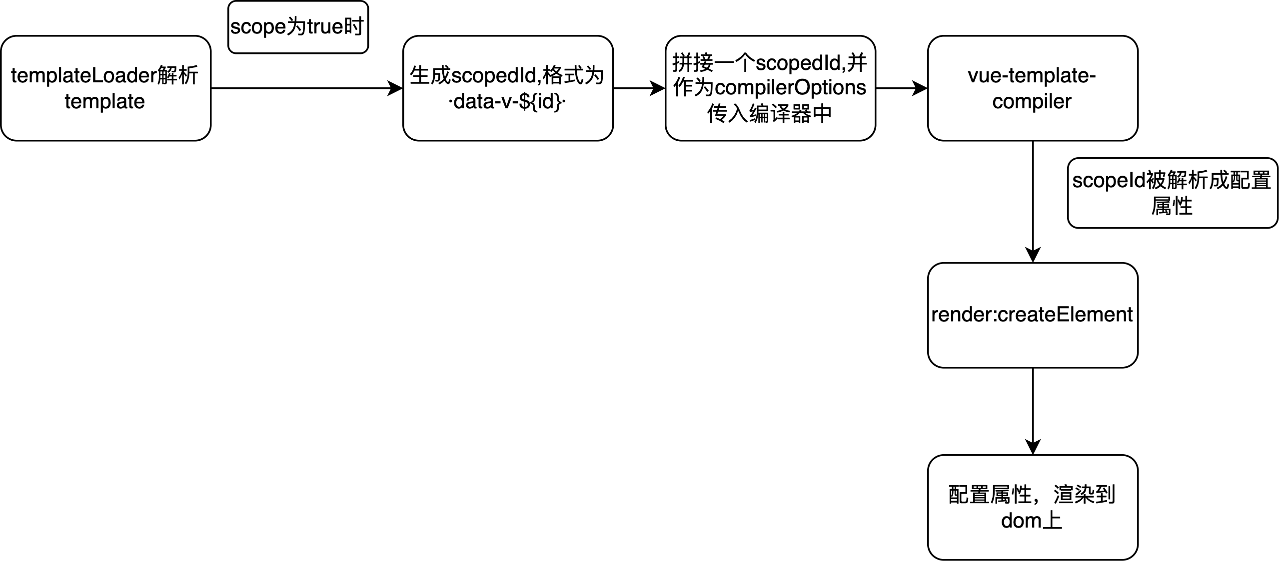
# 2.scoped原理
- 使得样式只在当前组件内生效
- 通过
PostCSS转译实现 - 每个 Vue 文件都将对应一个唯一的 id,该 id 根据文件路径名和内容 hash 生成,通过组合形成scopeId
- 编译 template 标签时,会为每个标签添加了当前组件的scopeId
- 编译 style 标签时,会根据当前组件的 scopeId 通过属性选择器和组合选择器输出样式
// 转译前的vue代码
<style scoped>
    .example {
    color: red;
}
</style>
<template>
    <div class="example">hi</div>
</template>
1
2
3
4
5
6
7
8
9
2
3
4
5
6
7
8
9
// 转义后
<style>
    .example[data-v-5558831a] {
    color: red;
}
</style>
<template>
    <div class="example" data-v-5558831a>hi</div>
</template>
1
2
3
4
5
6
7
8
9
2
3
4
5
6
7
8
9
- 过程流程图
# 3.keep-alive原理,在react中如何实现类似功能,周期的销毁和启动显示等
- keep-alive有两个独立的生命周期钩子函数actived和deactived
- 用keep-alive包裹的组件在切换时不会被销毁,而是缓存到内存中并执deactived钩子函数,命中缓存渲染后会执行 actived 钩子函数
- keep-alive用于保存组件的渲染状态,它不会生成真正的DOM节点,在keep-alive中,设置了abstract:true,那Vue就会跳过该组件实例
- 在组件切换过程中 把切换出去的组件保留在内存中,防止重复渲染DOM,减少加载时间及性能消耗,提高用户体验性
- react中实现,react-activation,用 KeepAlive 包裹需要保持状态的组件,在不会被销毁的位置放置 AliveScope外层
- ClassComponent 可配合 withActivation 装饰器
- 使用 componentDidActivate 与 componentWillUnactivate 对应激活与缓存两种状态
- FunctionComponent 则分别使用 useActivate 与 useUnactivate hooks 钩子
# 4.css实现红黄蓝灯动画
::after,每个div元素的内容之后插入新内容
content: ''; display: inline-block; width: 70px; height: 70px; border-radius: 50%;
animation: traffic-light 5s linear 0s infinite;
@keyframes traffic-light { from{} 25%{} 50%{} 75%{} to{}}
background: transparent;
box-shadow:-85px 0 0 0 transparent, 85px 0 0 0 transparent, -85px 0 15px 0 transparent, 0px 0 15px 0 transparent, 85px 0 15px 0 transparent;
实现代码
<!DOCTYPE html>
<html lang="en">

<head>
    <meta charset="UTF-8">
    <meta name="viewport" content="width=device-width, initial-scale=1.0">
    <title></title>
    <style>
        body {
            margin: 0;
            /*!* 绝对定位使height: 100%生效 /*/
            position: absolute;
            height: 100%;
            width: 100%;
            }
            /*背景图 使用margin auto实现垂直水平居中*/
            .wrap {
            position: absolute;
            top: 0;
            left: 0;
            right: 0;
            bottom: 0;
            margin: auto;
            width: 500px;
            height: 350px;
            background: rgb(97, 170, 189);
            }
            /*灯框架*/
            .traffic-light {
                /*居中代码*/
            position: absolute;
            top: 0;
            left: 0;
            right: 0;
            bottom: 0;
            margin: auto;
            text-align: center;

            /*/ 绘制图案 /*/
            width: 300px;
            height: 90px;
            background: #282f2f;
            border-radius: 50px;
            box-shadow: 0 0 0 2px #eee inset;
            }
            .traffic-light::after {
            /*/ 居中代码 /*/
            position: absolute;
            top: 50%;
            left: 50%;
            transform: translate(-50%, -50%);

            content: '';
            display: inline-block;
            width: 70px;
            height: 70px;
            border-radius: 50%;

            animation: traffic-light 5s linear 0s infinite;
            }

            @Keyframes traffic-light {
            from {
            /*/ 黄灯 /*/
            background: transparent;

            box-shadow:
            /*/ 红灯 /*/
            -85px 0 0 0 transparent,
            /*/ 绿灯 /*/
            85px 0 0 0 transparent,
            /*/ 红灯光影 /*/
            -85px 0 15px 0 transparent,
            /*/ 黄灯光影 /*/
            0px 0 15px 0 transparent,
            /*/ 绿灯光影 /*/
            85px 0 15px 0 transparent;
            }
            25% {
            /*/ 黄灯 /*/
            background: transparent;

            box-shadow:
            /*/ 红灯 /*/
            -85px 0 0 0 rgb(247, 78, 26),
            /*/ 绿灯 /*/
            85px 0 0 0 transparent,
            /*/ 红灯光影 /*/
            -85px 0 15px 0 rgb(247, 78, 26),
            /*/ 黄灯光影 /*/
            0px 0 15px 0 transparent,
            /*/ 绿灯光影 /*/
            85px 0 15px 0 transparent;
            }
            50% {
            /*/ 黄灯 /*/
            background: rgb(231, 183, 78);

            box-shadow:
            /*/ 红灯 /*/
            -85px 0 0 0 transparent,
            /*/ 绿灯 /*/
            85px 0 0 0 transparent,
            /*/ 红灯光影 /*/
            -85px 0 15px 0 transparent,
            /*/ 黄灯光影 /*/
            0px 0 15px 0 rgb(231, 183, 78),
            /*/ 绿灯光影 /*/
            85px 0 15px 0 transparent;
            }
            75% {
            /*/ 黄灯 /*/
            background: transparent;

            box-shadow:
            /*/ 红灯 /*/
            -85px 0 0 0 transparent,
            /*/ 绿灯 /*/
            85px 0 0 0 rgb(38, 175, 84),
            /*/ 红灯光影 /*/
            -85px 0 15px 0 transparent,
            /*/ 黄灯光影 /*/
            0px 0 15px 0 transparent,
            /*/ 绿灯光影 /*/
            85px 0 15px 0 rgb(38, 175, 84);
            }
            to {
            /*/ 黄灯 /*/
            background: transparent;

            box-shadow:
            /*/ 红灯 /*/
            -85px 0 0 0 transparent,
            /*/ 绿灯 /*/
            85px 0 0 0 transparent,
            /*/ 红灯光影 /*/
            -85px 0 15px 0 transparent,
            /*/ 黄灯光影 /*/
            0px 0 15px 0 transparent,
            /*绿灯光影*/
            85px 0 15px 0 transparent;
         }
        }
    </style>
</head>
<body>
<div class="wrap">
    <div class="traffic-light"></div>
</div>
</body>
</html>
1
2
3
4
5
6
7
8
9
10
11
12
13
14
15
16
17
18
19
20
21
22
23
24
25
26
27
28
29
30
31
32
33
34
35
36
37
38
39
40
41
42
43
44
45
46
47
48
49
50
51
52
53
54
55
56
57
58
59
60
61
62
63
64
65
66
67
68
69
70
71
72
73
74
75
76
77
78
79
80
81
82
83
84
85
86
87
88
89
90
91
92
93
94
95
96
97
98
99
100
101
102
103
104
105
106
107
108
109
110
111
112
113
114
115
116
117
118
119
120
121
122
123
124
125
126
127
128
129
130
131
132
133
134
135
136
137
138
139
140
141
142
143
144
145
146
147
148
149
150
151
152
# 5.flex实现九宫格
- 父:display:flex; flex-wrap:wrap;
- 子:flex-grow:1;
- :nth-of-type(3n), margin-right: 0;
<ul class="square-inner flex">
    <li>1</li>
    <li>2</li>
    <li>3</li>
    <li>4</li>
    <li>5</li>
    <li>6</li>
    <li>7</li>
    <li>8</li>
    <li>9</li>
</ul>
.flex{
    display: flex;
    flex-wrap: wrap;
}
.flex>li{
    flex-grow: 1; /* 子元素按1/n的比例进行拉伸 */
    background-color: #4d839c;
    text-align: center;
    color: #fff;
    font-size: 50px;
    line-height: 2;
}
.flex>li:nth-of-type(3n){ /* 选择个数是3的倍数的元素 */
    margin-right: 0;
}
.flex>li:nth-of-type(n+7){  /* 选择倒数的三个元素,n可以取0 */
    margin-bottom: 0;
}
1
2
3
4
5
6
7
8
9
10
11
12
13
14
15
16
17
18
19
20
21
22
23
24
25
26
27
28
29
2
3
4
5
6
7
8
9
10
11
12
13
14
15
16
17
18
19
20
21
22
23
24
25
26
27
28
29
# 6.代码判断题
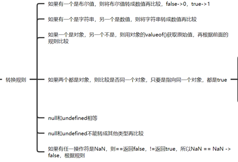
- 为false的数据有0,[], undefined, NaN
- 0 == false , true
- [] == false , true
- null/undefined == false , false
- null == undefined , true
- const a = [1, 2, 3],const b = [1, 2, 3], a == b ,false, 两个对象不会相等,引用类型,地址不一样
- const a = [1, 2, 3], const c = "1,2,3", a == c, true, 数组会变成字符串再比较,引用类型会依照ToPrimitive规则转换为原始类型
- ToPrimitive规则,是引用类型向原始类型转变的规则,它遵循先valueOf后toString的模式期望得到一个原始类型
JavaScript 隐式类型转换 (opens new window)
- 总结:
# 7.Promise.all和await的区别
- 两者都是异步处理
- Promise.all:将多个Promise实例包装成一个新的Promise实例,所有执行完后返回一个结果数组,总时长以最长的函数为准
- await: 按照程序书写顺序,依次执行,时间是几者相加
# 8.代码输出,输出值以及时间间隔
for (var i = 0; i< 5; i++) {
        console.time('tests')
        setTimeout(() => {
            console.log(i)
            console.timeEnd('tests')
        }, 1000)
    }
    // 5个5
    // 根据不同机器,变化在1s左右
    // tests: 1005.676025390625 ms
1
2
3
4
5
6
7
8
9
10
2
3
4
5
6
7
8
9
10
const list = [1, 2 ,3]
    const run = num => {
      return new Promise((resolve, reject) => {
          setTimeout(() => {
              resolve(num)
          }, 1000)
      })
    }
    function fn() {
      list.forEach(async x => {
          console.time('tests')
          const res = await run(x)
          console.timeEnd('tests')
          console.log(res, '111111')
      })
    }
    fn()
    // 1 2 3
    // tests: 1004.31201171875 ms,执行更快
1
2
3
4
5
6
7
8
9
10
11
12
13
14
15
16
17
18
19
2
3
4
5
6
7
8
9
10
11
12
13
14
15
16
17
18
19
# 9.列举一些Ts的泛型工具,并描述其用法
- typeof:对象,可先定义变量,再定义类型
- keyof: 枚举类型,取出一个对象中的所有由key值组成的枚举类型
- Partial:将传入的属性变为可选项
- Required:将传入的属性变为必选项
- Mutable:未包含属性
- Readonly:将传入的属性变为只读选项
- Record:将 K 中所有的属性的值转化为 T 类型
- Pick:从 T 中取出 一系列 K 的属性
- Exclude:条件类型
- Extract:提取出 T 包含在 U 中的元素
- Omit:未包含,忽略对象某些属性功能
- ReturnType:获取函数的返回类型
- AxiosReturnType:未包含的接口请求类型
# 10.轮播图实现逻辑,左右回到原点的逻辑,图片大小不一怎么办,图片怎么传进来(有多种方式),如果有视频,代码片段呢
- 左:index小于数组长度时,index - 1,否则index为0
- 右:index小于数组长度时,index + 1,否则index为数组长度
- 左右回到原点的逻辑,图片无缝切换:transition: 1s;translateX我们在最后一张图片的后面加上第一张图片(第6张)可以让用户看到滚动效果,然后滚动到第六张时,再改变ul回到初始位置
- 图片大小不一致解决:给div设置
display:inline-block,display: block;和一样的宽高,然后将图片作为div的背景图来显示,利用background-size和background-position,用overflow属性取剪裁
.Mine-categories-swipe img{
    // display: inline-block;
    display: block;
    width: 100%;
    height: 100%;
    background-size: cover;
    background-position: center;
    background-repeat: no-repeat;
    background-image: url('');
}
1
2
3
4
5
6
7
8
9
10
2
3
4
5
6
7
8
9
10
- 图片怎么传过来:转base64方式一般在小型项目中使用,大文件上传还是传统的formdata或者云服务,更合适
- 有视频,代码片段处理,轮播插件:iSlider
- 假如数组元素为图片,打开定时器开始轮播;假如是视频,@ended="fn",autoplay, muted,等到视频播放完成后再轮播下一个内容